
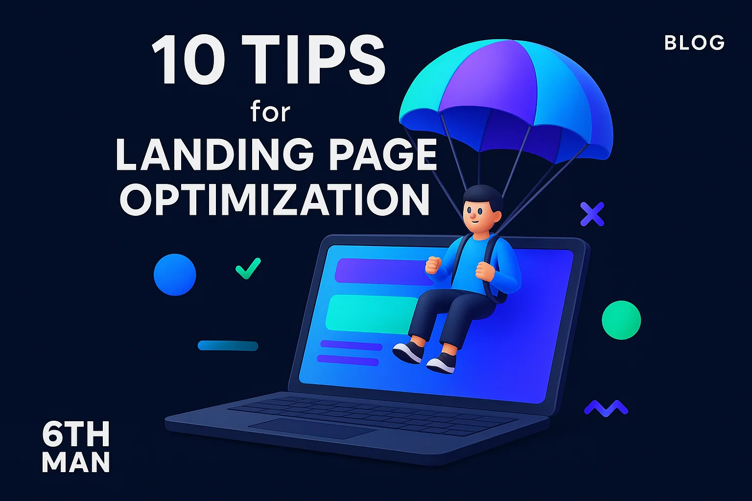
10 tips for landing page optimization
Effective 10 tips for landing page optimization can double your conversion rate in a matter of weeks. This guide delivers 10 actionable strategies that performance marketers and growth leads use to turn paid traffic into measurable business outcomes. Expect proven methods for CTA design, speed tuning, ad-message match, live urgency signals, and testing frameworks powered by GA4, Optimizely, and Hotjar heatmaps.
Every visitor who lands on your page represents an investment. When that page fails to convert, you waste budget and miss revenue. The difference between a converting page and one that bleeds spend comes down to clarity, speed, trust, and data-driven iteration. Below you will find a structured approach to each of those pillars.
Tip 1: Make your CTA visible and benefit-led
Your call-to-action button should appear above the fold, using high-contrast color and benefit-driven copy. Instead of "Submit" or "Learn More," state the value: "Get Your Free Audit" or "Unlock 24/7 Support." A visible CTA converts better because users do not need to scroll to take action.
Position: Place the primary button in the top third of the viewport on desktop and mobile. Repeat it after each value section for visitors who scroll. Color contrast: Your button must pass WCAG AA standards for accessibility and stand out against the background. Benefit-driven language beats generic verbs because it clarifies what happens next.
Test button text, placement, and color variations. One test showed a 17% lift simply by changing "Sign Up" to "Start My Trial." That small copy tweak reframed the action from commitment to exploration. When your CTA communicates a tangible benefit, friction drops and click-through rises.
Tip 2: Cut load time and prioritize speed
Landing page speed directly impacts conversion. A delay of one second can reduce conversions by 7%. Mobile users abandon pages that take longer than three seconds to load. Fast pages keep attention; slow pages lose prospects before they read a single word.
Optimize images by compressing them to WebP format and serving responsive sizes. Lazy-load assets below the fold so critical content renders first. Minify CSS and JavaScript, defer non-essential scripts, and enable browser caching. Use a content delivery network to reduce latency for global traffic.
Monitor Core Web Vitals using Google Search Console and PageSpeed Insights. Aim for a Largest Contentful Paint under 2.5 seconds and a Cumulative Layout Shift below 0.1. These metrics correlate directly with user satisfaction and bounce rate performance. Speed is not a nice-to-have; it is a conversion multiplier.
Tip 3: Match the message from ads to the landing page
Ad-message match means the promise in your ad copy must align with the headline and hero section on your landing page. When a user clicks an ad about "free shipping on orders over €50," they expect that offer front and center. Misalignment triggers confusion and drives immediate exits.
Consistency builds trust. Use the same keywords, value propositions, and visual cues from your ad creative on the page. If your ad highlights a 30-day trial, your headline should reinforce it: "Start Your 30-Day Free Trial Today." Repetition reduces cognitive load and reassures visitors they are in the right place.
Audit your campaigns by pairing each ad group with a dedicated landing page. Generic pages dilute relevance. Segmented pages that mirror ad intent convert two to three times better because they eliminate the mental gap between expectation and reality. Strong ad-message match shortens the decision path.
Tip 4: Provide urgency with accurate live signals
Live signals like "Currently in stock" or "12 people viewing this offer" create urgency without deception. Authenticity matters. Fake countdown timers and invented scarcity erode trust, but real-time inventory updates or booking activity reinforce that action should happen now.
Display availability status near your CTA. Show remaining inventory, active users, or slots left for a webinar. Dynamic content that updates based on actual data converts better than static claims. For example, a real estate landing page might display "3 units left at this price," updated hourly from the CRM.
Avoid exaggeration. If you say "Only 2 left," ensure it is true. Prospects who return to find the same message lose confidence in your brand. Accurate urgency nudges hesitant buyers; dishonest tactics backfire and damage long-term conversion rates.
Tip 5: Use Hotjar to analyze friction and validate hypotheses
Hotjar heatmaps reveal where users click, scroll, and drop off. Session recordings show real navigation patterns: which sections get ignored, where users hesitate before exiting, and how forms create friction. These insights guide decisions that A/B tests alone cannot surface.
Start by installing Hotjar on your highest-traffic landing pages. Review heatmaps to see if users engage with your CTA or scroll past it. Watch session replays to identify confusion points such as unclear copy, broken links, or form fields that users abandon halfway through. Friction: If 60% of visitors do not scroll past the hero, your value proposition may be weak. Fix: Tighten the headline and add social proof above the fold. Result: More engagement deeper into the page.
Use Hotjar's feedback polls to ask departing visitors why they did not convert. Their answers often point to objections you can address directly in your copy or design. Analyzing behavior before you test prevents wasted experiments on low-impact changes. For deeper SEO insights and optimization tactics, pair qualitative analysis with quantitative tracking.
Tip 6: Keep forms short and reduce friction
Every form field you add increases friction and lowers completion rates. Ask only for information you absolutely need at this stage. Name and email may suffice for a newsletter; phone and company size can wait until the sales call.
Multi-step forms often outperform single-page designs for complex offers because they feel less overwhelming. Break a ten-field form into three steps with a progress indicator. Autofill and input validation reduce effort. Inline error messages guide users immediately instead of forcing them to hunt for mistakes after submission.
Test removing optional fields. One SaaS company cut form abandonment by 22% by eliminating job title and company name from their demo request. Fewer fields mean less perceived commitment and faster completion. Balance data collection with user experience; you can always enrich records later through follow-up or automation.
Tip 7: Build trust with social proof and clear guarantees
Social proof reduces perceived risk. Testimonials, case study snippets, client logos, and review ratings reassure new visitors that others have bought and benefited. Trust signals matter most for high-ticket or unfamiliar offers.
Place a short testimonial or star rating near your CTA. Use real names, photos, and company details when possible. Generic praise lacks credibility; specific outcomes ("Increased leads by 80% in 60 days") build confidence. Link to detailed case studies for prospects who need more proof.
Add guarantees that lower anxiety: money-back promises, free trials, or no-commitment demos. A clear refund policy or free cancellation removes the fear of being locked in. When visitors see that others have succeeded and that they can exit if unsatisfied, conversion barriers fall.
Tip 8: Prioritize above-the-fold clarity and visual hierarchy
Above-the-fold content must answer three questions instantly: What is this? Who is it for? What do I do next? If a visitor cannot answer all three within five seconds, they bounce. Clarity drives action; confusion kills it.
Lead with a headline that states the core benefit. Follow with a subheadline that adds context or addresses the pain point. Use a supporting visual such as a product screenshot, hero image, or short explainer video. Place your primary CTA prominently so it is impossible to miss.
Visual hierarchy guides the eye. Use size, color, and whitespace to direct attention from headline to value prop to CTA. Avoid clutter. Every element should support the conversion goal. Remove navigation menus or links that distract from the primary action. A focused layout converts; a busy one overwhelms.
Tip 9: Test headlines, CTAs and layouts with Optimizely
A/B testing landing page variants reveals what truly moves the needle. Optimizely and similar platforms let you test headlines, button copy, form length, and entire layout structures. Data beats intuition. Small changes can yield double-digit conversion lifts.
Run tests one variable at a time for clean attribution. Test headline A versus headline B, keeping everything else constant. Once a winner emerges, test the next element. For bigger redesigns, use multivariate testing to compare combinations of changes. Always let tests reach statistical significance before declaring a winner.
Common winning tests include benefit-driven headlines over feature lists, first-person CTA copy ("Start My Trial") over second-person ("Start Your Trial"), and single-column layouts over multi-column designs. Track not just conversion rate but also downstream metrics like trial activation or purchase value. High conversions mean nothing if the leads do not convert to revenue. Pair landing page testing with robust paid media strategies to maximize ROI.
Tip 10: Track conversions and funnel behavior with GA4
GA4 landing page tracking shows which sources drive quality traffic, where users drop off, and how behavior differs by device or campaign. Set up events for page views, scroll depth, CTA clicks, and form submissions. Conversion tracking without funnel analysis leaves you blind to optimization opportunities.
Create a funnel report in GA4 that maps the journey from landing page view to CTA click to form submission to thank-you page. Identify the step with the highest drop-off. If 70% of visitors click the CTA but only 30% submit the form, friction lies in the form itself. If users do not scroll, your above-the-fold content fails to engage.
Segment traffic by source to compare paid search, social ads, and organic visits. Often, one channel delivers higher volume but lower conversion rates. Allocate budget accordingly. Use custom dimensions to track campaign parameters like ad group or creative variant. Detailed GA4 data feeds smarter iteration. For a complete view of your funnel, explore key B2B SaaS metrics and how they tie to landing page performance.
Recap: 10 tips for landing page optimization — priorities and quick wins
Start with speed and CTA visibility. A fast page with a clear, benefit-led button above the fold prevents immediate exits. Next, align your ad messaging and add live urgency signals to reduce hesitation. Use Hotjar to surface friction, then simplify forms and add trust elements like testimonials and guarantees.
Refine above-the-fold hierarchy so visitors grasp your offer instantly. Test headlines, CTAs, and layouts with Optimizely to discover what resonates. Finally, track everything in GA4 to measure funnel drop-offs and attribute conversions accurately. Quick wins: Compress images, rewrite your headline to emphasize benefits, and trim your form to three fields. Each of these changes can be live within hours and lift conversions by 10% or more.
When to optimize your landing page
Optimization is not a one-time project. Markets shift, audiences evolve, and competitors launch new offers. Knowing when to refresh your page versus when to rebuild it entirely determines how efficiently you allocate resources.
Signals that you need optimization now
Low conversion rates signal immediate action. If your page converts below 2% for lead gen or 1% for e-commerce, basic optimizations such as CTA tweaks or speed improvements can double performance. High bounce rates above 70% indicate misalignment or poor user experience. Visitors arrive but leave without engaging.
Traffic quality matters too. If GA4 shows strong session duration but weak conversions, your page interests users but fails to close them. Test messaging clarity and CTA strength. If average session duration is under 30 seconds, you have an above-the-fold problem: unclear value prop, slow load, or broken design on mobile.
Campaign changes warrant page updates. Launching a new offer, targeting a different segment, or testing a price change all require aligned landing page content. Reusing old pages for new campaigns dilutes relevance and tanks performance. Optimization keeps your pages synchronized with your go-to-market motion.
When to consider a redesign instead
A redesign makes sense when incremental tweaks cannot fix structural issues. If your page layout confuses users, your copy buries the value prop three paragraphs deep, or your design looks dated compared to competitors, a full rebuild delivers better ROI than endless A/B tests.
Brand refresh or product pivot also demands a new page. If your positioning changes, your landing page must reflect that shift. Redesign when you expand into a new market or launch a fundamentally different offer. A SaaS company pivoting from small businesses to enterprise buyers needs a page that speaks enterprise language and addresses enterprise concerns.
Technology debt is another trigger. If your current platform limits speed, mobile responsiveness, or tracking capabilities, migrate to a modern stack. Old CMS platforms or hard-coded HTML pages restrict agility. A redesign on a flexible tool like Webflow or a headless CMS future-proofs your optimization efforts. Pair landing page evolution with strong landing page development expertise to avoid technical limitations.
Common mistakes and quick diagnoses
Most landing page failures stem from a handful of repeated errors. Recognizing them accelerates diagnosis and shortens the path to better results.
Slow page speed, mixed messages, and too many CTAs
Slow pages lose half your visitors before the content loads. Diagnose with PageSpeed Insights. If your score is below 50 on mobile, image compression and script optimization are urgent. Mixed messages confuse prospects. If your ad promises a free trial but your headline talks about pricing plans, visitors bounce because expectations do not match reality.
Too many CTAs scatter focus. Offering "Download the Guide," "Book a Demo," and "Start Free Trial" on one page forces users to choose, and choice creates friction. Pitfall: Multiple competing CTAs. Fix: Select one primary action per page. Result: Clear path to conversion and higher click-through.
Visual clutter overwhelms. Walls of text, dense paragraphs, and crowded layouts drive users away. Break copy into scannable chunks. Use bullet points sparingly, headers frequently, and whitespace generously. A clean design guides attention; chaos repels it.
Overloaded forms and missing tracking
Forms with ten fields kill completion rates. Diagnose by checking analytics for form abandonment. If 80% of users who click your CTA never submit, your form is too long or unclear. Remove optional fields. Use conditional logic to show additional questions only when relevant.
Missing tracking prevents learning. If GA4 events are not firing for CTA clicks or form submissions, you are flying blind. Set up event tracking, test it in debug mode, and validate data flows into your dashboard. Without accurate data, you cannot measure impact or prioritize fixes.
Broken mobile experience is another common mistake. Desktop designs often fail on small screens: tiny tap targets, horizontal scroll, or text that requires zooming. Test on real devices. A page that works beautifully on a 27-inch monitor can be unusable on a smartphone. Mobile-first design avoids this trap.
Measure, test and iterate with GA4, Optimizely and Hotjar
Sustainable improvement requires a closed loop: measure behavior, test hypotheses, analyze results, and iterate. The right tools accelerate each step.
How to set up GA4 events for landing pages
GA4 events capture user interactions beyond page views. Start by defining key actions: scroll to 50%, CTA click, form field focus, form submission, and thank-you page view. Each event represents a micro-conversion that builds toward your primary goal.
Set up events through Google Tag Manager for flexibility. Create triggers for button clicks by targeting CSS classes or element IDs. Track scroll depth with a percentage-based trigger. Mark conversions in GA4 by toggling the "Mark as conversion" switch for submission and purchase events.
Build custom reports that show conversion funnels by traffic source, device, and campaign. Compare how organic, paid, and social traffic progresses through your funnel. Use these insights to allocate budget toward high-performing channels and optimize pages for underperforming segments. Clear event tracking transforms raw traffic into actionable intelligence.
Running reliable A/B tests with Optimizely
Reliable A/B testing requires sufficient sample size and statistical significance. Optimizely calculates this automatically, but understanding the principles prevents premature decisions. A test needs at least 100 conversions per variant to detect meaningful differences. Running a test for a week on 50 daily visitors yields inconclusive noise.
Define one hypothesis per test. Changing headlines and button colors simultaneously makes attribution impossible. Test headline A versus headline B first. Once a winner emerges, test the next element. Document every test with a hypothesis, expected outcome, and actual result. This history informs future experiments and prevents retesting the same ideas.
Watch for external factors. A seasonal promotion, website downtime, or competitor campaign can skew results. Pause tests during anomalies and restart when conditions normalize. Trust statistical significance over gut feeling. A 5% lift that is significant at 95% confidence beats a 15% lift from a small, noisy sample.
Using Hotjar to generate test hypotheses
Hotjar bridges the gap between analytics and empathy. GA4 tells you what users do; Hotjar shows you why. Start by filtering session recordings for users who bounced within 30 seconds. Watch ten recordings to identify common patterns: do they scroll, click, or leave immediately?
Heatmaps highlight ignored sections. If your testimonials receive zero clicks and minimal scroll attention, they may need repositioning or more compelling copy. Use feedback polls to ask, "What stopped you from completing this form?" Answers often reveal objections you had not considered, such as unclear pricing or missing trust badges.
Turn observations into testable hypotheses. Hypothesis: Visitors abandon forms because field labels are unclear. Test: Replace "Company Name" with "Your Company (e.g., Acme Corp)." Expected outcome: 10% reduction in form abandonment. Hotjar-driven hypotheses are grounded in real user behavior, not guesswork, leading to higher test win rates.
A one-page prelaunch checklist
Before you push a new landing page live, run through a comprehensive checklist. Catching issues pre-launch prevents wasted ad spend and protects conversion rates.
Technical checks, tracking, messaging, and CRO quick wins
Technical: Test load speed on desktop and mobile. Compress images, minify code, and confirm server response times under two seconds. Check all links to ensure they point to the correct destinations. Verify form submissions trigger confirmation emails and route data to your CRM. Test on multiple browsers and devices to catch rendering bugs.
Tracking: Confirm GA4 events fire for page view, scroll, CTA click, and form submission. Use Tag Assistant to validate tags load correctly. Check UTM parameters append properly for campaign attribution. Set up conversion goals and test end-to-end tracking from ad click to thank-you page.
Messaging: Review headline and hero section for clarity. Does a first-time visitor immediately understand the offer? Match ad copy to on-page content. Remove jargon. Read the entire page aloud; awkward phrasing jumps out when spoken. Ensure CTAs state benefits, not actions.
CRO quick wins: Place CTA above the fold. Add one testimonial or trust badge near the button. Trim form fields to the minimum required. Confirm mobile tap targets meet the 48px standard. Run a final accessibility check for color contrast and alt text. Each of these items takes under ten minutes but protects against easily avoidable conversion killers.
Contact our team to improve your landing pages
Implementing 10 tips for landing page optimization requires strategy, technical skill, and ongoing testing. Whether you need full-funnel audits, conversion-focused design, or data-driven experimentation, expert support accelerates results.
How to book a review with 6th Man Digital
6th Man Digital delivers expert-led digital marketing for e-commerce and B2B businesses. Our team combines senior-level CRO expertise with hands-on execution across paid media, SEO, and automation. We plug into your operations like an in-house team, move fast, and focus relentlessly on measurable growth.
Book a free landing page review to identify your highest-impact optimization opportunities. We analyze speed, messaging, funnel behavior, and tracking setup, then deliver a prioritized roadmap with quick wins and long-term strategies. No fluff, no vague recommendations, just clear actions that drive conversions and revenue.
.jpeg)